Platform & member portal

Expertise
Tech Stack
Challenge
The Genossenschaftsverband Bayern (GVB) wanted to bundle its diverse services and advisory offerings on a clear and modern platform in order to offer members and interested parties easy access.
Solution
With the relaunch of the GVB website, we have created a platform that transfers the GVB's vision into the digital world. The new site offers a clear structure for public and internal content, integrates complex rights and role structures and enables efficient administration and communication within the association thanks to customised modules.
Addressing the different target groups in two areas
The relaunch focussed on the digital implementation of the vision to establish the GVB as the most modern and attractive ecosystem for cooperatives. An essential decision in the website concept was to differentiate between two information architectures with a public and an internal area for members.
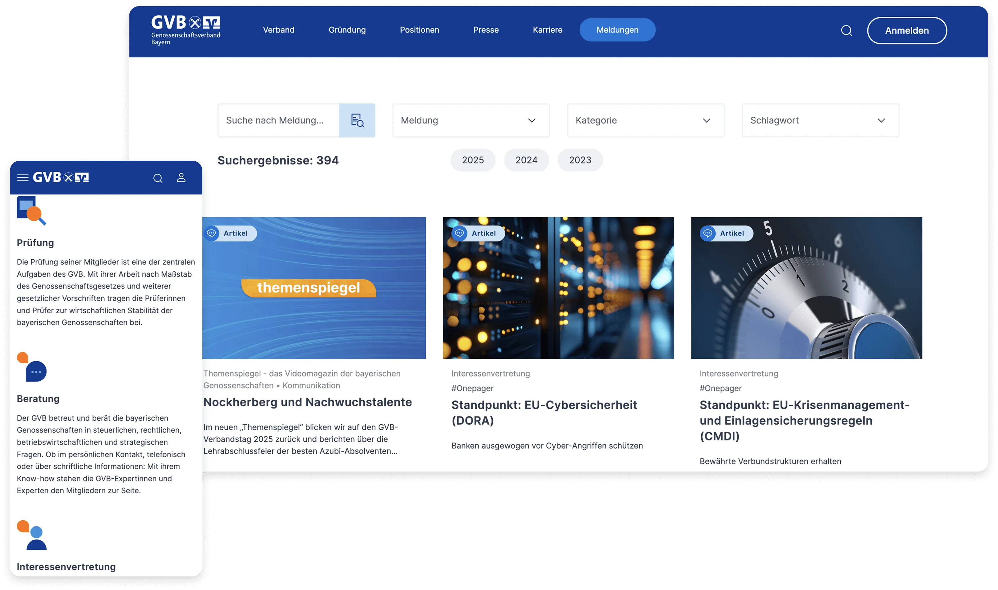
The public side primarily serves to present the association to the outside world: What services does the GVB provide? How does the GVB work? How does the GVB provide support when setting up a cooperative? Current news in the form of articles make the public area interesting for a broad target group.
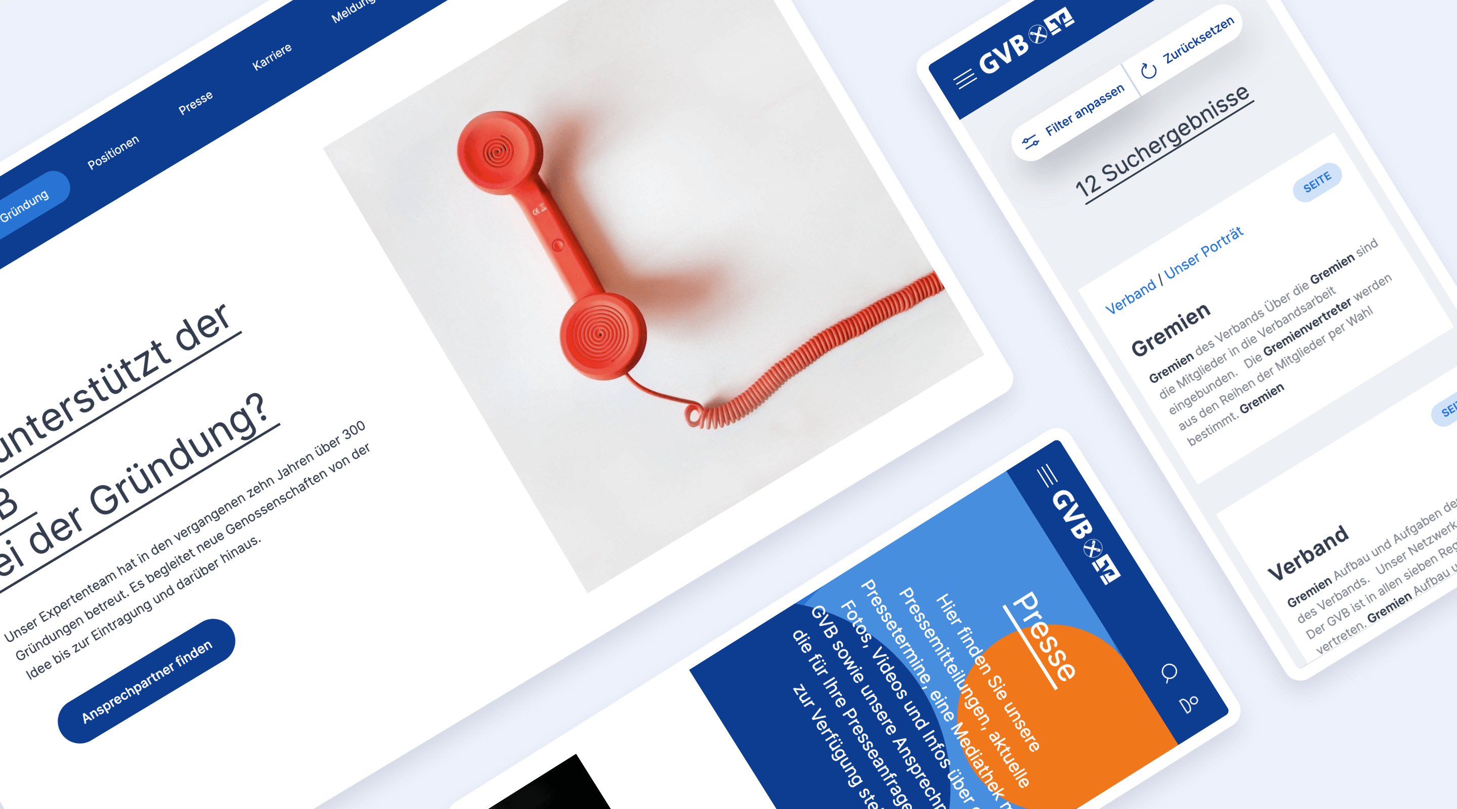

A tool for everyday work
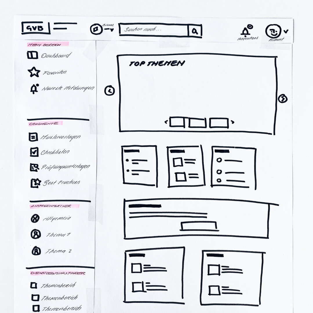
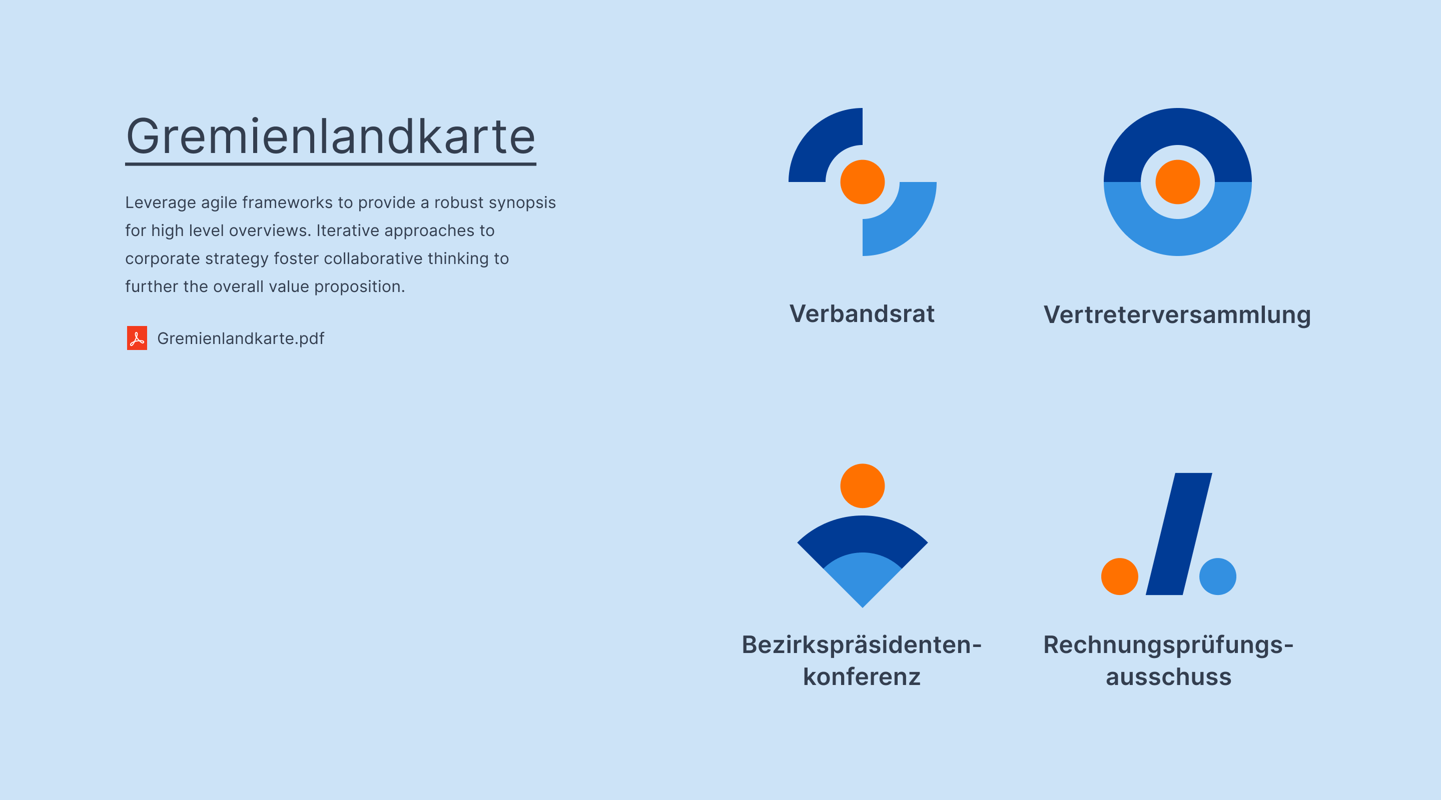
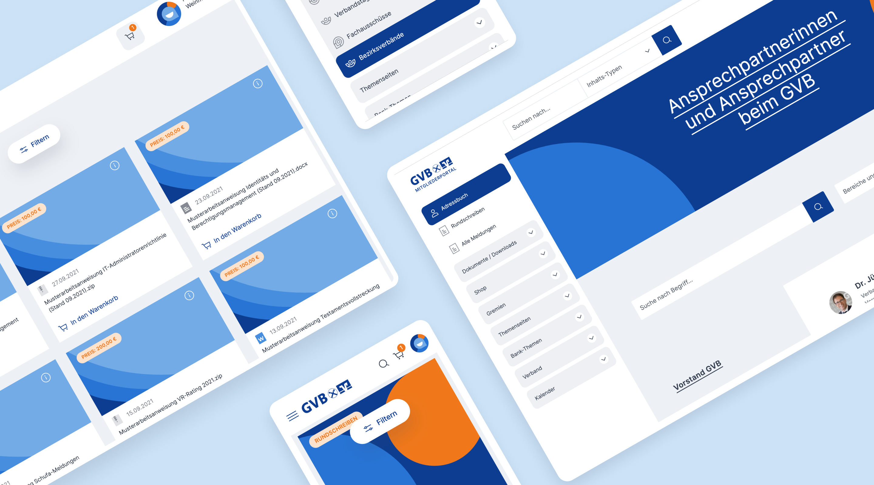
The internal area serves as a tool for members' day-to-day business: here, users can find news from the GVB's specialist areas, useful working documents and can purchase digital products in a specially developed shop.
A complex system of rights and roles enables members to be assigned. Depending on their role assignment, users see a customised and individual portal. In a second step, the newsletters displayed according to user group are also sent out in a customised newsletter - also with a new look, of course.
Liveliness and order through geometric shapes
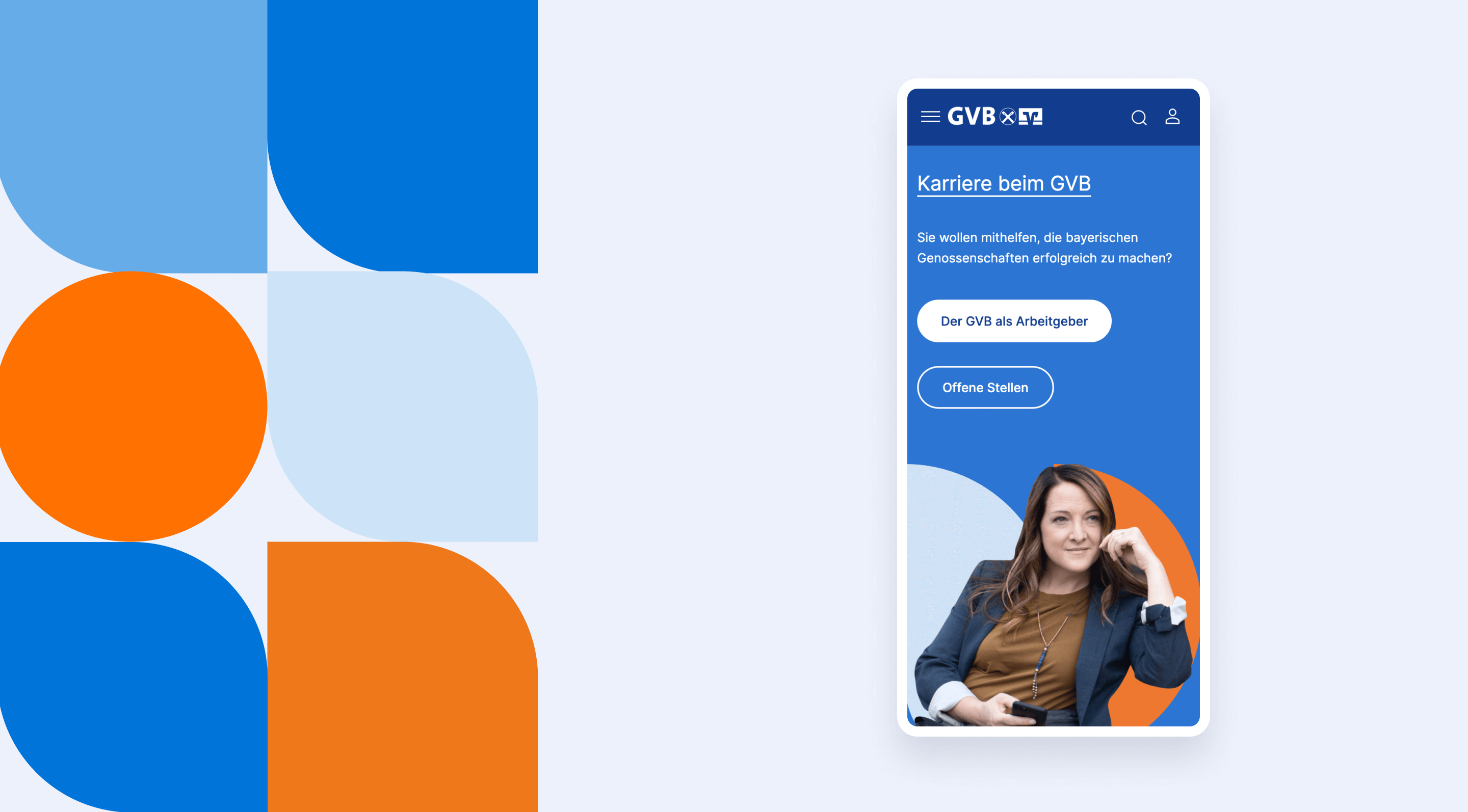
The predominantly blue colour scheme in the design reflects the regional aspect and the home of the GVB - beautiful Bavaria. A striking shade of orange acts as an accent colour and highlights individual elements and areas. In order to reflect both dynamics (exchange, ecosystem, network) and structure (organisation of information) in the UI, we worked with a geometric mosaic grid that can be used as a background element in various places.
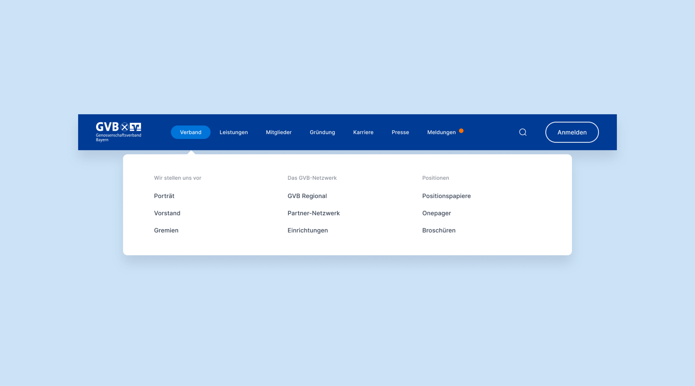
The two areas on the platform are separated by differently structured navigation. While the public area has a mega menu, the complex information architecture in the member area is integrated in a sidebar.
The technology behind it

The platform is based on the Neos content management system. The complex rights and role structure, the numerous customised interfaces to various third-party systems and the large scope of the individually developed modules made the project a particularly exciting task. Protected downloads, an integrated shop, the customised newsletter system, circulars with workflow management and a contact management system are just a few examples of these modules that were customised for the customer.

